Final Fantasy 7 Rebirth released a demo and... there are yellow painted cliffs, reigniting a conversation that keeps coming up every few months. Now, I have no exact opinion on its use in FF7R. It seems to be explained in universe (it's a temporary route, purposefully marked), and marking paths is hardly a sin. Hinting at the so called Golden Path is a fundamental aspect of level design. This isn't about FF7R.
... But oh god did it unfortunately choose that yellow paint that has come to symbolize a type of hand holding that has been wearing on players over the last decade. It has started to feel similar to the ancient Old Man Murray "Start to Crate" system, judging a game on "How long it took to see a crate", representing the point where "the developers ran out of ideas".
This standard wasn't exactly fair and neither is judging a game on using yellow paint. FF7R is probably fine, because again, this isn't about FF7R. It is, of course, not even about the yellow paint. It's about what the yellow paint represents.
It's Not About Leaving the Player to Struggle
A lot of people have responded to this pushback saying of COURSE modern games have to do this. They have to appeal to everyone. People didn't spend $60 dollars on a game just to get lost. Companies have to do this to make money you know!
But they don't have to. People will quickly point to Souls games, and while that works, those games always seem like they don't count. The exception, no matter how much they sell. You can't actually learn from them (even if you obviously can)... but I'm going to talk about Nintendo. Nintendo has played around on all fronts of tutorialization. Nintendo has many different kind of designers working for them. They can fall into bad habits like all of us but they tend to be ahead of the curve. Even going back to Super Mario Odyssey you can see what they chose to and what they chose not to communicate. You get your magic hat. It tells you to use it immediately. On the side of the screen is a video of human hands, doing the motion to throw your hat. The game wants to make sure you know how to use this basic ability.
... But then it doesn't tell you what to do with it. It doesn't even tell you what it does. It just surrounds you with things that can interact with this ability. It creates a space for play. You're here to play the game, right? "Oh here is a ledge that is too tall? Try catching this frog" ... and then what? Like obviously you know, and the game isn't even trying to make you feel clever for using the ability to jump without being told. You're not being told what to do because there isn't any rush. You'll jump up when you're ready. Because you're here to play... right?
Nintendo games will do things to help stuck player, to nudge them along. They'll use, like everyone else, basic level design to guide you around, but the goal usually isn't to get you to go The right way but to show you all the places you can go so you can play.
... And Dark Souls isn't much different. We might want to pretend the game is negligently unconcerned with our enjoyment but it is merely doing as much as it feels it needs to do to encourage play. Getting lost is part of the play, so you are given enough room to get lost. But discovery is also an important part of the experience so there needs to be enough things to entertain yourself finding before you stumble onto the right path. The game isn't indifferent to you, it's trying to enrich you and give you what it sees to be a good experience.
It's Not About Tricking Players into Thinking They're Smart
A type of response I saw from a lot of fellow game designers who didn't immediately dismiss the issue went kinda like this... "Okay look, players don't mind being lead around! They just don't like when it's obvious! They want to be lead around! So we have to trick them better so they think they're clever."
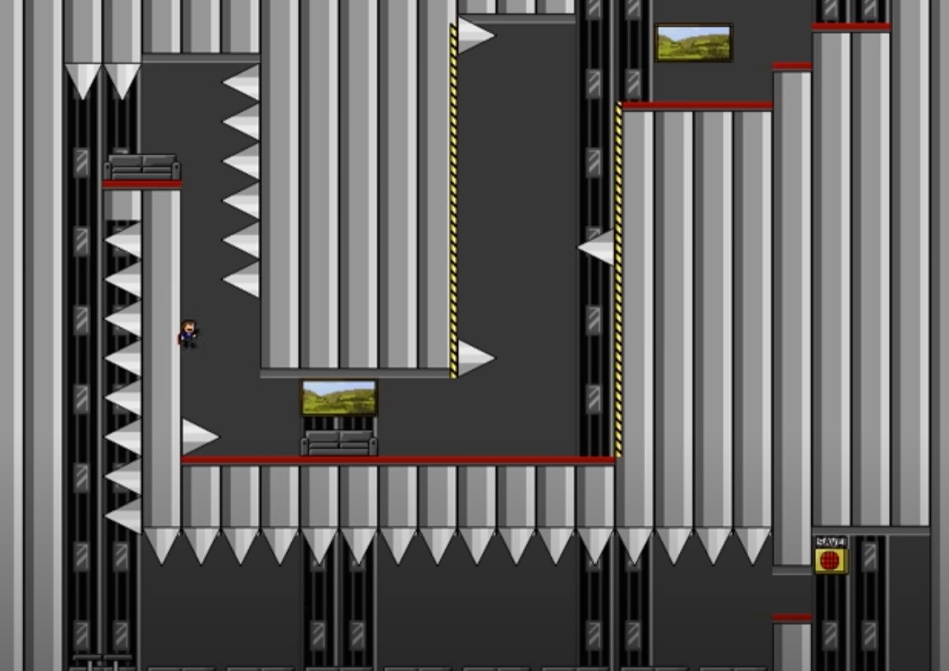
The painful thing here is that the general idea isn't wrong. The framing though... it bugs me. It bugs me a lot. People would accuse me and I Wanna be the Guy of adversarial game design, but honestly, no. I think this is adversarial. Not having a fun, playful relationship with the player, but looking at the player as an obstacle between us and our intended experience.
A designer friend of mine, Zara, said "Maybe it'd help if we didn't see players as a particularly stubborn breed of dog" and I feel like that's how a lot of designers look at game design. Like we're magicians, trying to fake emotions and accomplishments. We will lead the horse to water, and we will make them drink their $60+ worth of game. Nobody thinks they're smart for finding the ladder... and sure, they might feel dumb if they can't find the ladder. But we all feel dumb when we don't feel like we're trusted enough to even try.
If we design our games with the assumption that the player is an idiot, then they will feel that resentment when we hold their hand.
Enrichment, Agency, and Overly Paternalistic Game Design
As a kid, did you ever plan on doing something useful without being asked? Taking out the trash, or doing the dishes unprompted? Being proactive, showing thoughtfulness? ... and as you walk out of your room to do to the thing, a parent turns to you and goes "Hey, can you take out the trash?"
Maybe it's not with a parent. Maybe it's a boss, or a loved one. Regardless, no one in this situation is doing anything wrong but gosh does it feel like something was taken away... Worse, it often isn't as enjoyable as it would have been if you just went out and did it without them saying anything. It has been turned back into work. Repeat this too often and a person might feel like no one thinks they're capable of making the right choices on their own. They lose their feeling of agency.
Game Designers force this situation a lot in modern times. Overly aggressive popups, color coding, 'helpful' partners who bark the solution to a puzzle at you while you're just looking around for a moment. Waypoints for everything, markers for everything. All of these things good in their own context, useful design elements when appropriately applied, stacked upon each other until the game designer becomes a hover parent trying to ensure the perfect experience. You must be protected from yourself. What if you get lost? What if you don't know what to do?
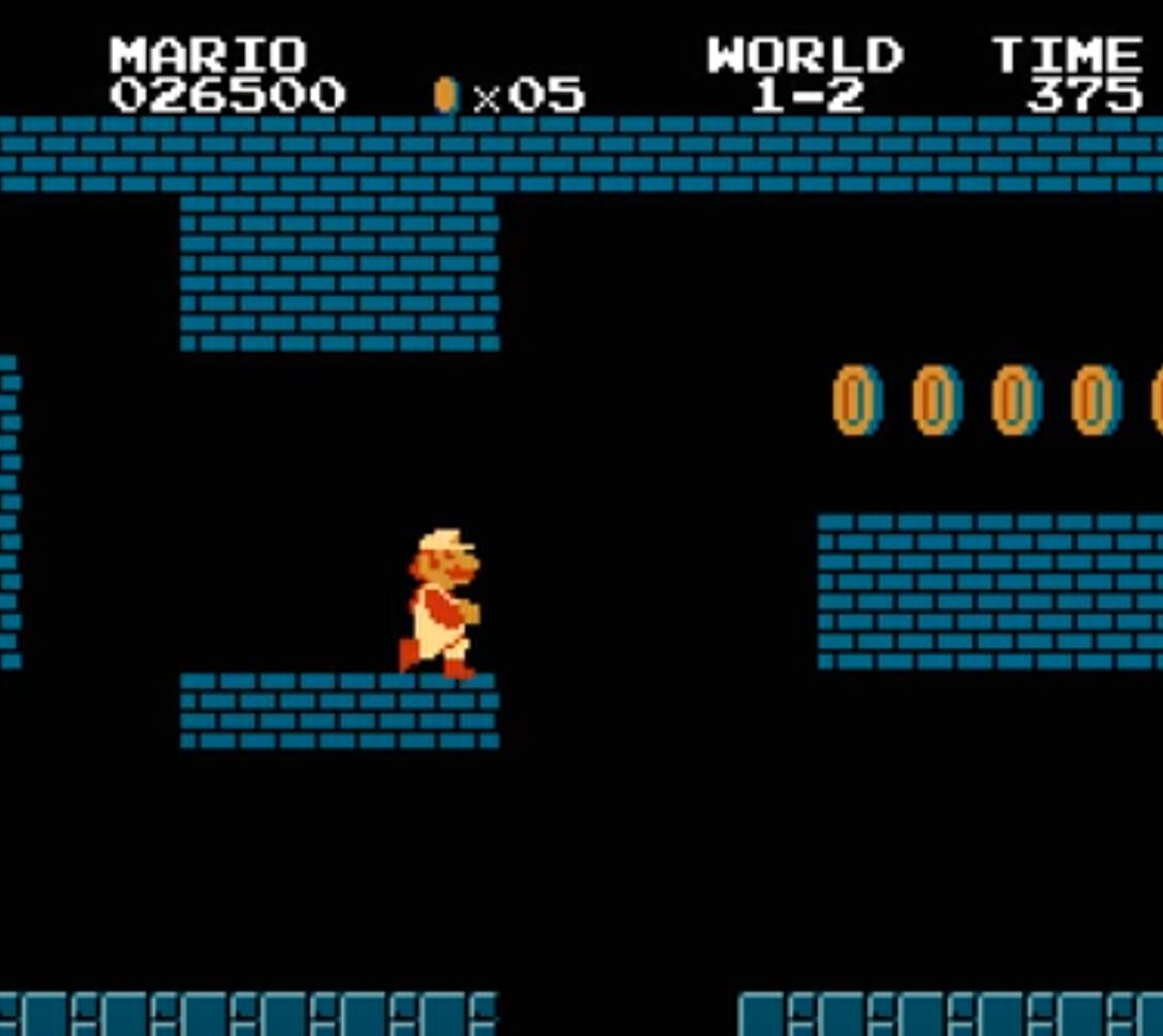
Hinting through level design is not new. It's ancient technology. Super Mario Bros' coins, Donkey Kong Country's bananas, every aspect of Doom's level design always tries to give you some idea where you should be going. Dark Souls does not lead you to grope blindly. Buildings convey their importance in the distance. Lighting cues help guide you. Even enemies can be a way to funnel you were you should go. The thing is though... Most of these old things aren't 'compulsory'. They are used to set the expectation. To get you to try new things. Mario will use coins to get you to jump places to do things you don't even expect to happen. Oh, what, I can break out of the ceiling? And I only noticed because I tried to get some coins? You are taught what to look for, and then you are allowed to find it later on your own. Games like DKC, or something like Super Metroid create a relationship with the player. These hints get played with, subverted, omitted, and inverted, all to slowly expand the problem space in your mind to help you have enriching play.
A lot of modern, condescending game design fails to create enrichment. It's about going on the ride. It's the overly scheduled trip to Europe your friend planned that has an itinerary down to the hour. Homie, we're not going to Europe again for years! We gotta MAXIMIZE. But by maximizing, you miss the real experience. You miss the lazy morning in Paris, wandering around until you find an espresso place. You don't look at the reviews, you just go in. You have an authentic, human experience. Could you have gotten better coffee? Could you have planned to take a bus at 8:45 over across the city to have coffee at the 3rd best reviewed espresso place in all of France? Sure, but are you here for the coffee, or are you here for the experience? It is the down time, the space between the notes that make experiences special. You don't get that when your character is telling you what you should be doing every 10 steps in whatever current grey goo ubisoft game is out right now.
People worry about games now being made for stupid people. Dumbed down for idiots. I don't like that kind of disdainful thinking, judging peoples intelligence by how they interact with mainstream videogames. No, instead, we make games for the uninvested. Games for the people who want the sampler plater of the current zeitgeist. A child, with an brain not yet fully developed, will get through these games. They will look up answers. They aren't getting every release. It isn't about intelligence. They are getting through these games because they care more, and they have been doing this since home consoles were a thing. Meanwhile, most of my peers are more concerned with avoiding FOMO.
Do players get stuck on the simplest things? Absolutely. But no one buys a 60 dollar game and gives up on it because of some easy problem that can be solved with a google search. They give up because they have 3 other 60 dollar games waiting to be played. I am left wondering if game devs are more concerned with fun experiences, or avoiding negative ones. That when you don't finish their game, you at least remember it fondly. That you come back for the DLC. That you consider the sequel. If you have to make too many decisions, you might make unfun ones, so they keep you on a tight gameplay loop.
It's not the made-up mythical "stupid gamers" (we all get stuck in silly ways and no one should be ashamed of that) bringing things down for everyone. It is our peers, who care more about being current than taking in an experience. Because we'll all get through whatever game ultimately catches our interest, no matter how obtuse it gets. But game devs can't count on that, so they keep you moving. It's Speed, with Keanu Reeves. Drop under 50 MPH and the player gets bored and moves on to the next Call of Duty game. Players will buy a game but don't play it with respect, instead turning a lot of their playtime into some weird cultural obligation, like watching the next marvel movie.
Game developers have a problem too. A huge problem is that watching someone get stuck is a thousand times worse than being stuck. This isn't just a developer problem, look at any twitch chat while someone is playing Dark Souls. Now imagine you made the game and you're watching. It's torture. My friend who conducts testing has to tell game devs to stay hands off. No interfering with the test!! The urge is there though. Every spot must be sanded down because watching someone get stuck for even a minute is worse than having a grain of sand stuck in your eye. But testing has its limitations. It can help you see how intuitive a menu is, or how well new players can understand your mechanics, but you can't recreate the moment of a bunch of people buying a new game and talking about it. Or recreate the focus and stubbornness of someone who has been waiting for this game for five years. It's the same reason you get a lot of weird stories about successful movies having bad test screenings. You cannot simulate your release audience. But you can polish a game until all texture is gone, and the experience is like a line at disneyland. Well designed, impressively built, highly detailed, but still... a vapid experience, cosplaying as a richer one.
Players don't respect the games they play enough to let themselves get stuck, and designers don't trust them enough to get stuck. This is the end result of a relationship built on disrespect, condescending parents speaking down to their disinterested children, who are so used to being micromanaged that they've gone numb. Testing can tell you a lot of things, but not what years of disrespect will cause in the player base.
It's not about yellow paint, it's about the fact the modern AAA space has forgotten how to have a dialog with the player. It has forgotten how to enrich and has instead decided to only try and wow. Most players don't even notice. They're so far behind in their backlog that they want content that can go down easily, not because they're not capable, but because they're overwhelmed. Culture moves so fast.
The yellow paint is just a reminder. Another unneeded reminder to do the dishes.


