 |
|
||
|
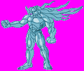
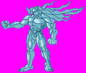
Firstly, I needed a sprite to work with so I picked Gill from Street Fighter 3.
|
||
|
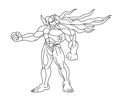
I loaded it up in Illustrator and enlarged it to 200%. I then traced Gill with normal paths with a stroke width of 1. Because it was going to be shrunk, there was no need to be precise.
|
||
|
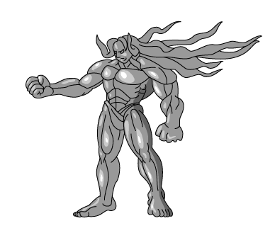
At this point, I could have exported it to Photoshop but I wanted to see how well Illustrator could handle the conversion to a GIF sprite. So what I did was create a filled shape underneath in grey. It wasn't easy because I had to take bunches of lines and make them into solid shape then unite them all together eventually. I wish there was a fill tool like in Flash because it would have made the job quicker. Anyway, once that was done, I just put in some quick highlights. I wanted to put in some dark areas but that would have taken ages considering the way it was being done. I ended up just putting in a small dark area just to see how it would work.
It's important to note here that I was "colouring"
in grey, so to speak, but this is because I don't have faith in
how well Illustrator converts full colour. I thought that it would
be better to colour later in Photoshop because I would have better
control when it came to the final sprite. |
||
|
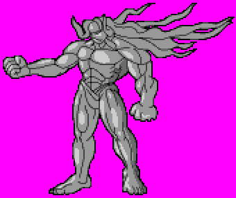
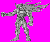
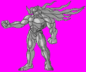
I used the 'Save to web' option and made three versions with different transparency matte colours. The matte colours are VERY important nere because they can determine how smooth the outline of a sprite can look. I saved the GIFs out with only 6 colours.
|
||
|
||
|
||
|
||
|
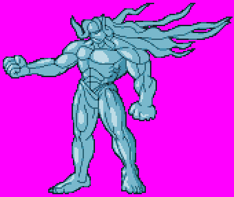
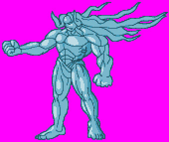
Once saved out I stuck them in Photoshop and gave them a little colouring just to see how they would look. These are the results.
|
||
|
||
|
||
|
||
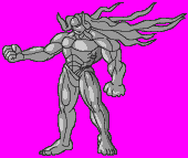
| It's probably easier to see them next to each other to compare and without the purple background. |

| The differences are more clearer in the colour version, though. |

|
Don't be tempted to use a white matte when exporting, though. Even though the white and white cleaned sprites may look good above, don't forget that mugen sprites are played at a larger size in reality and let's not forget the different coloured backgrounds which would give the light pixels away. ... and that's how the experiment turned out. There is alot of potential in Illustrator to create Mugen characters (IE graphics) but it can seem to be a slow process. The other problem is that you need to work in greyscale for better control when you make your palette from Photoshop. The other things that I didn't try was to use a custom stroke when drawing. I think that if I had made an art brush with a tapering stroke that I would have gotten fading lines. If I lightened the stroke colour to a dark grey instead of black, the sprite would have looked more natural, I think. Anyway, I hope this has inspired you somehow. It may not be perfect and it may be a tedious road but using a vector program like Illustrator, Flash or Freehand can really improve the look of your character. Good Luck Revanto |
